GRAPHIC DESIGN LOGO REDESIGN
WEB DESIGN
LOGO REDESIGN
Evasion Room is the second escape room that has opened its doors in Belgium. In 2015, they have created their first room, 9 years later they have 5 active adventures for their clients.
They have appointed me to update their designs, website and logo.
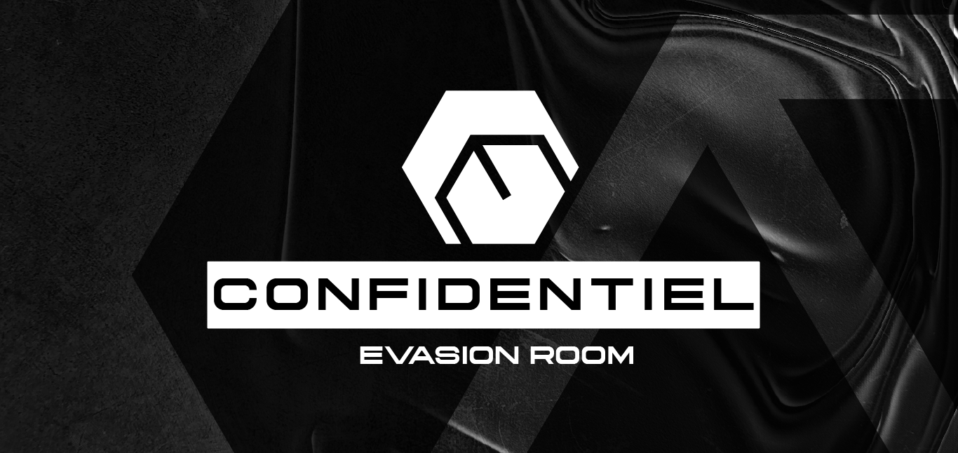
The logo was redesigned with a relevant font creating a more coherent feel with current trends in escape rooms designs. The new design is flatter therefore more modern.
The symbolism is inspired by their previous design, the maze. At first glance it is a hexagon, then you can see a subtle cube and finally an "E" for Evasion Room.
"The Live Escape Game" was removed for more readability and the red was removed to keep the logo sleek and easier to transpose on different media such as posters, social media posts and website.
GRAPHIC DESIGN
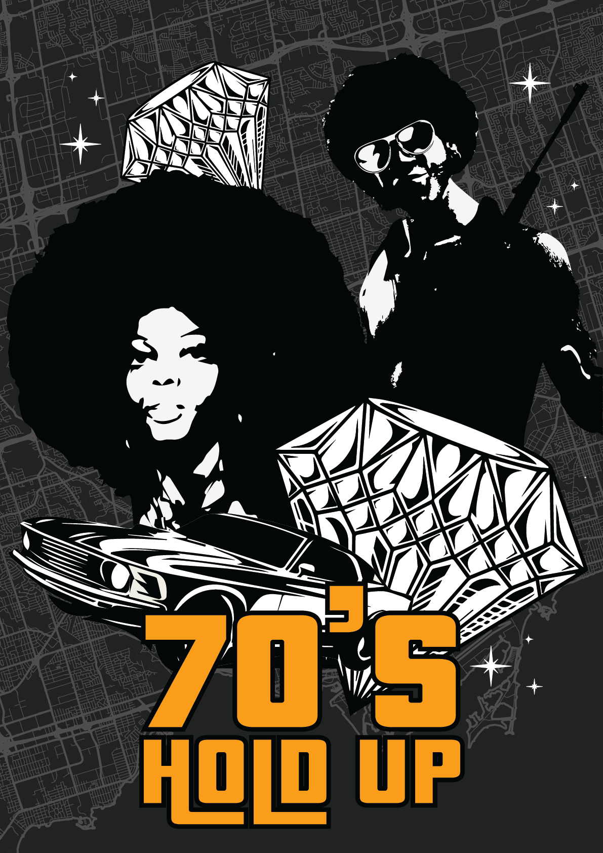
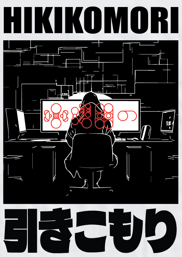
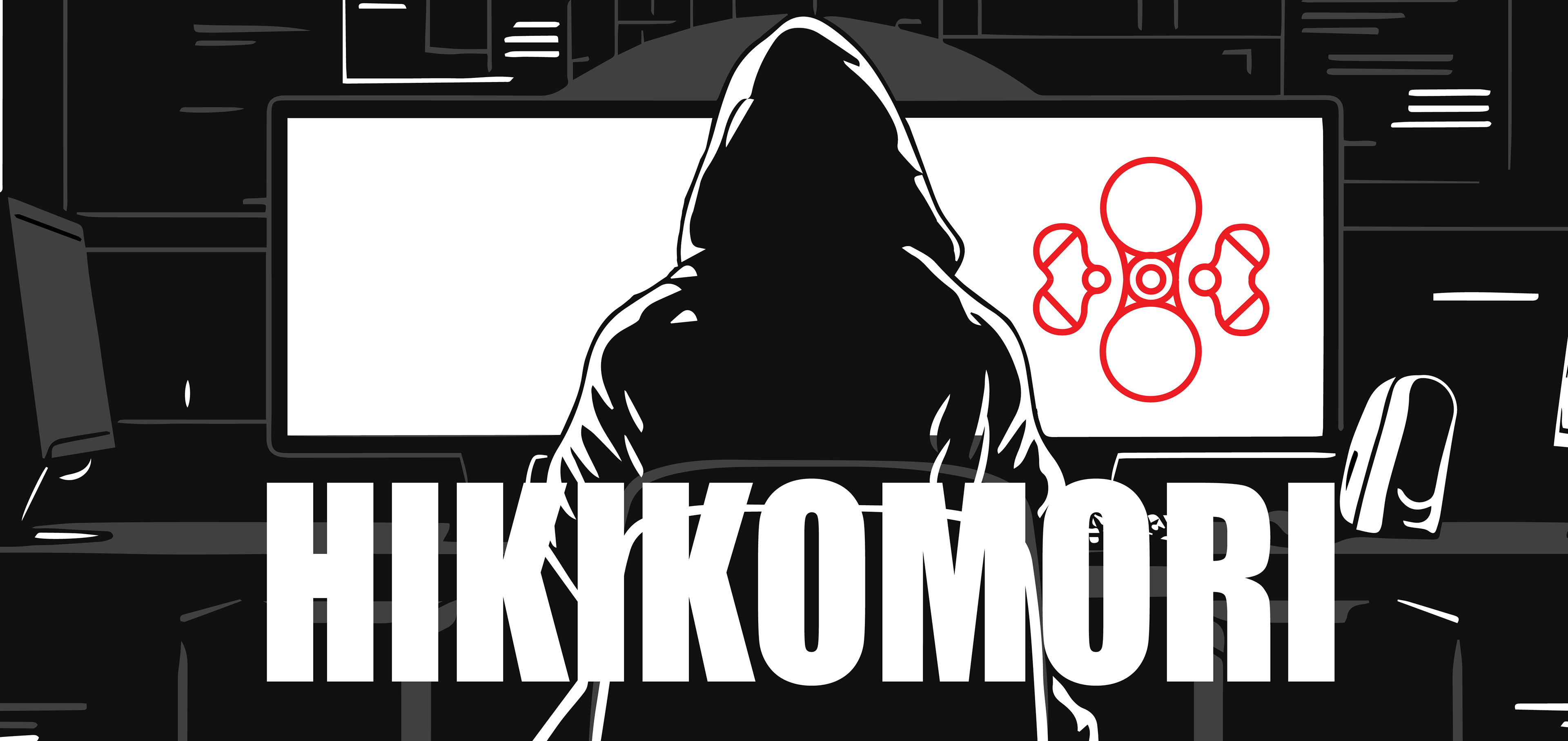
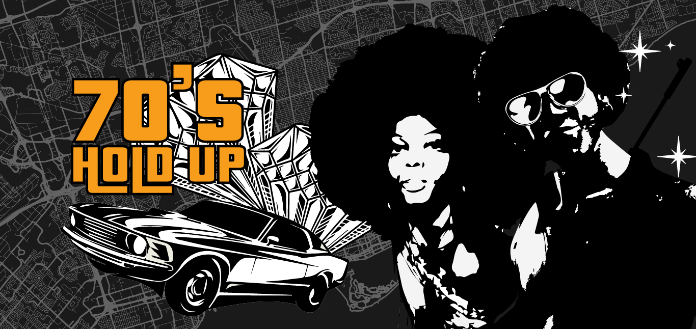
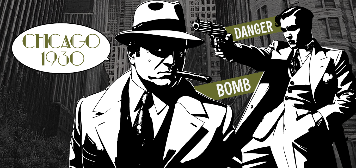
Each poster was created to decorate and hide clues in the 70's Hold Up room.
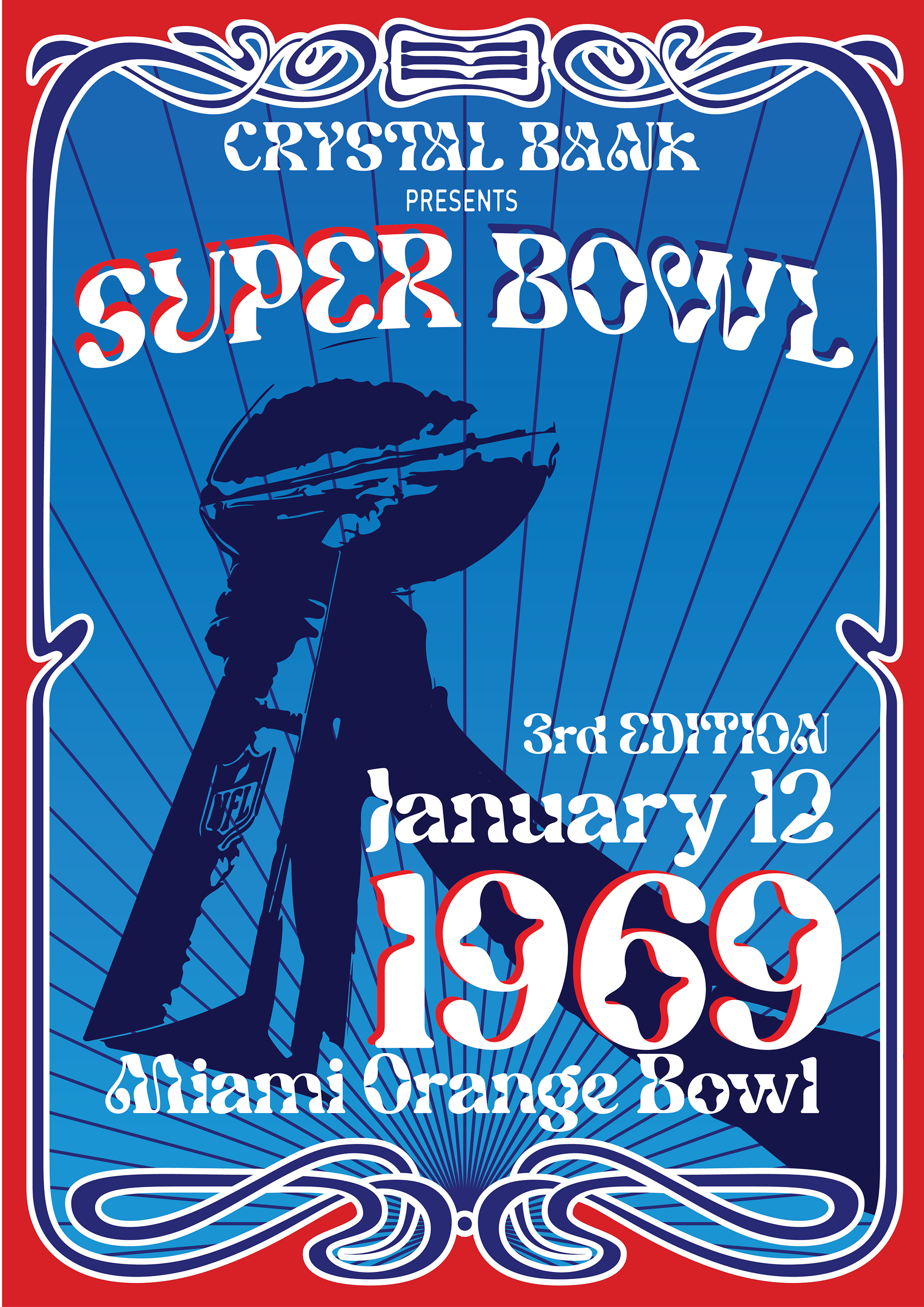
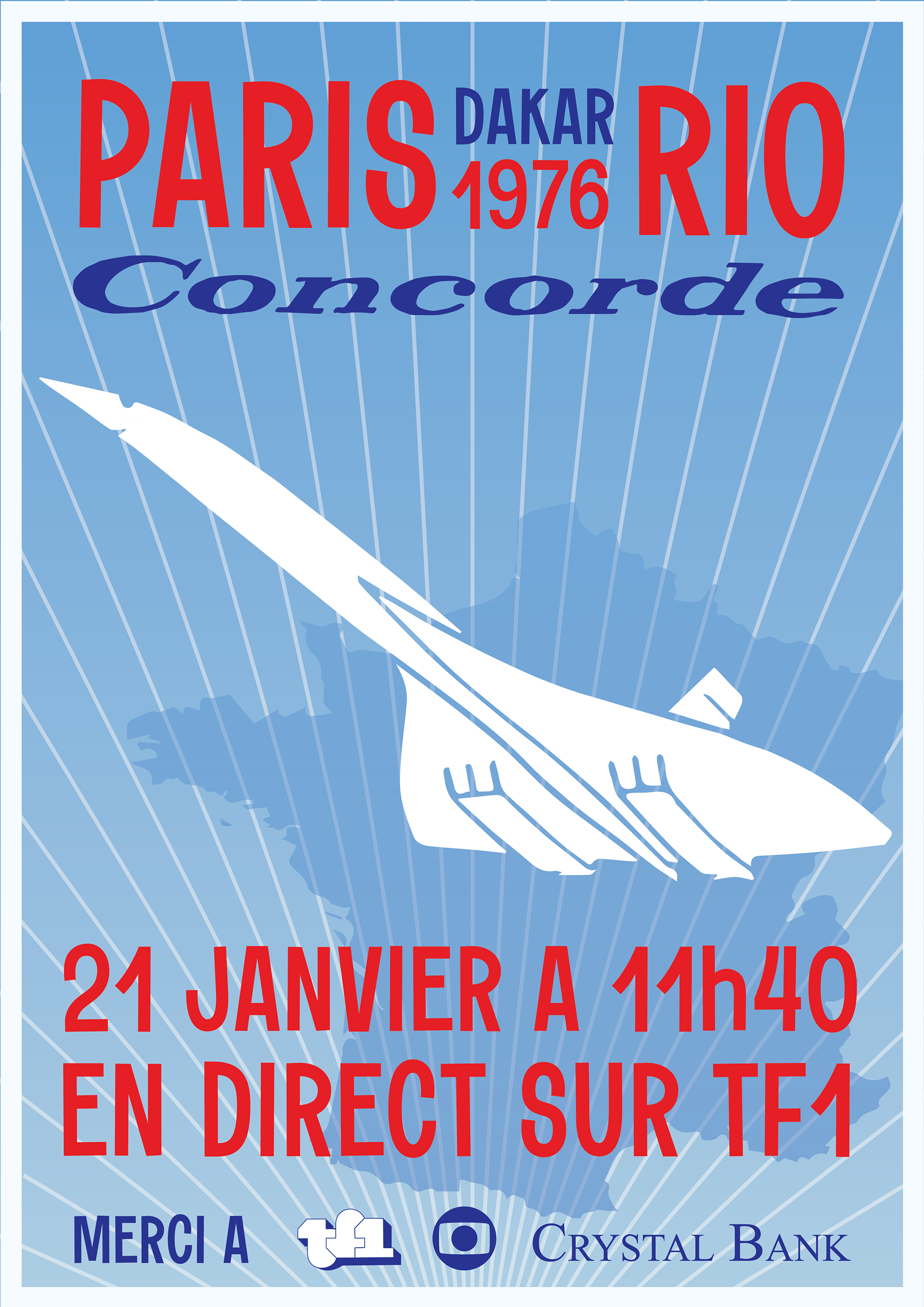
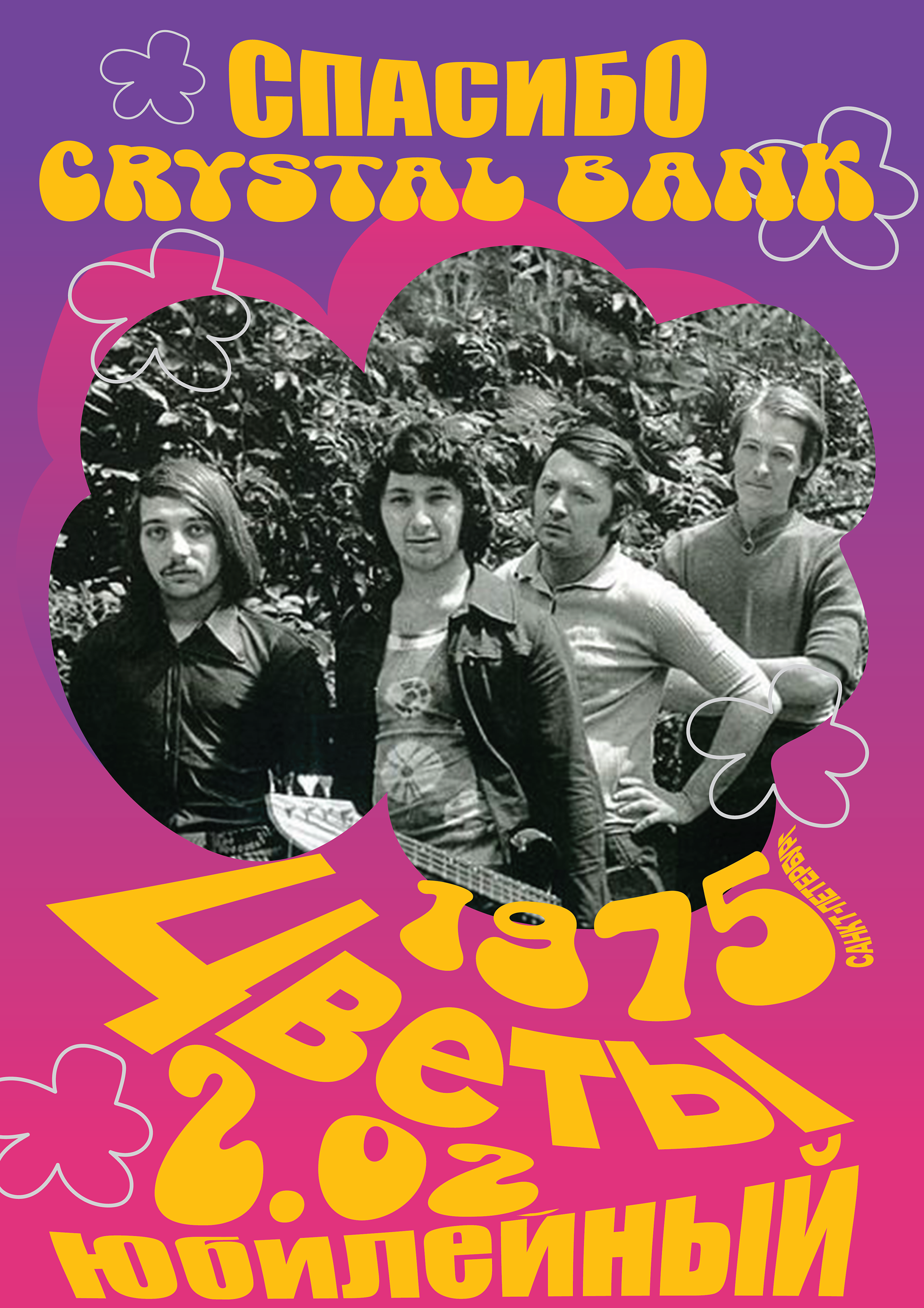
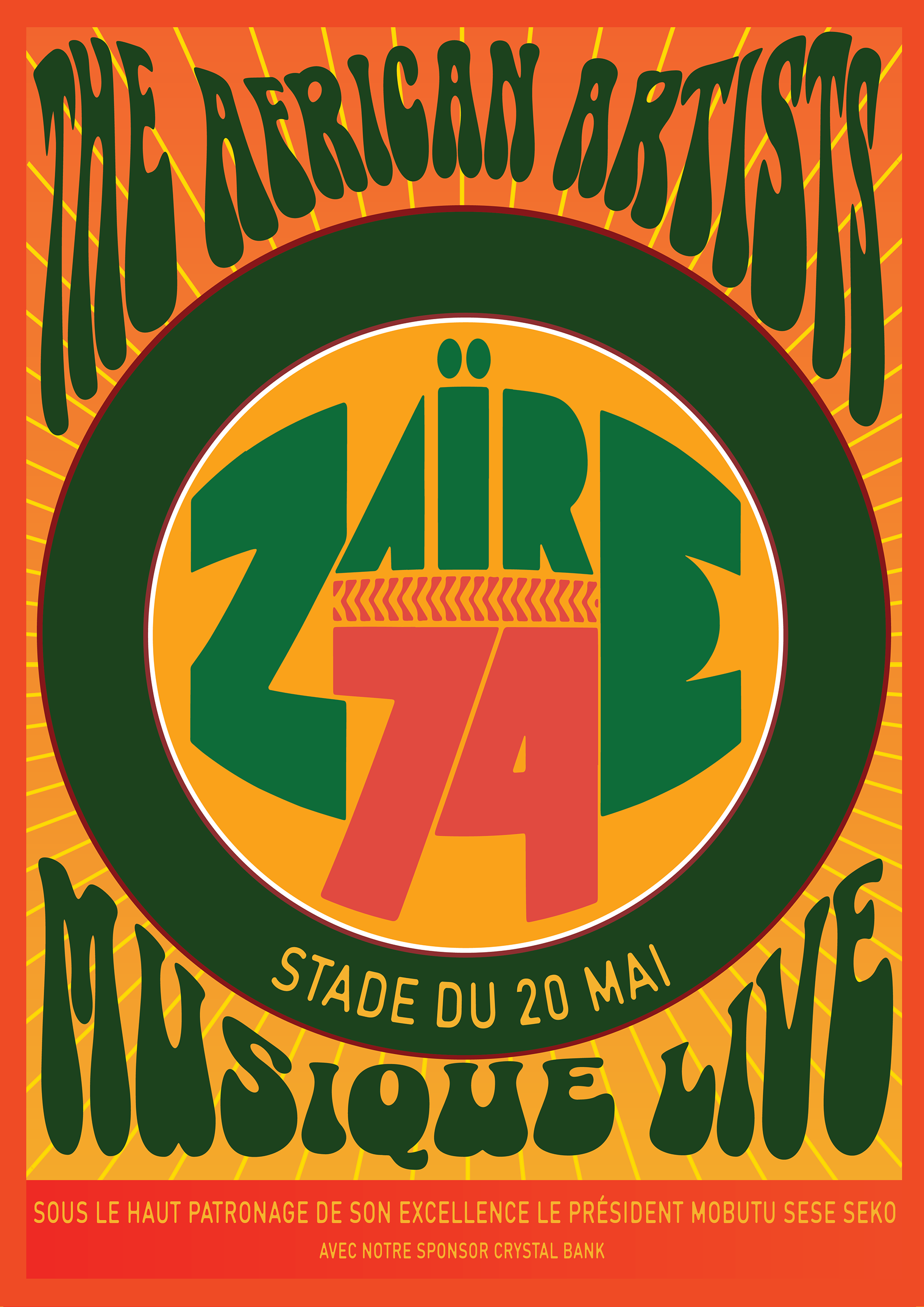
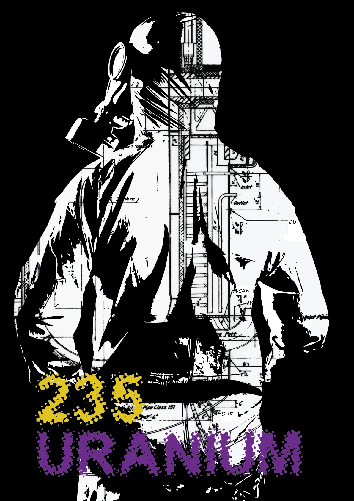
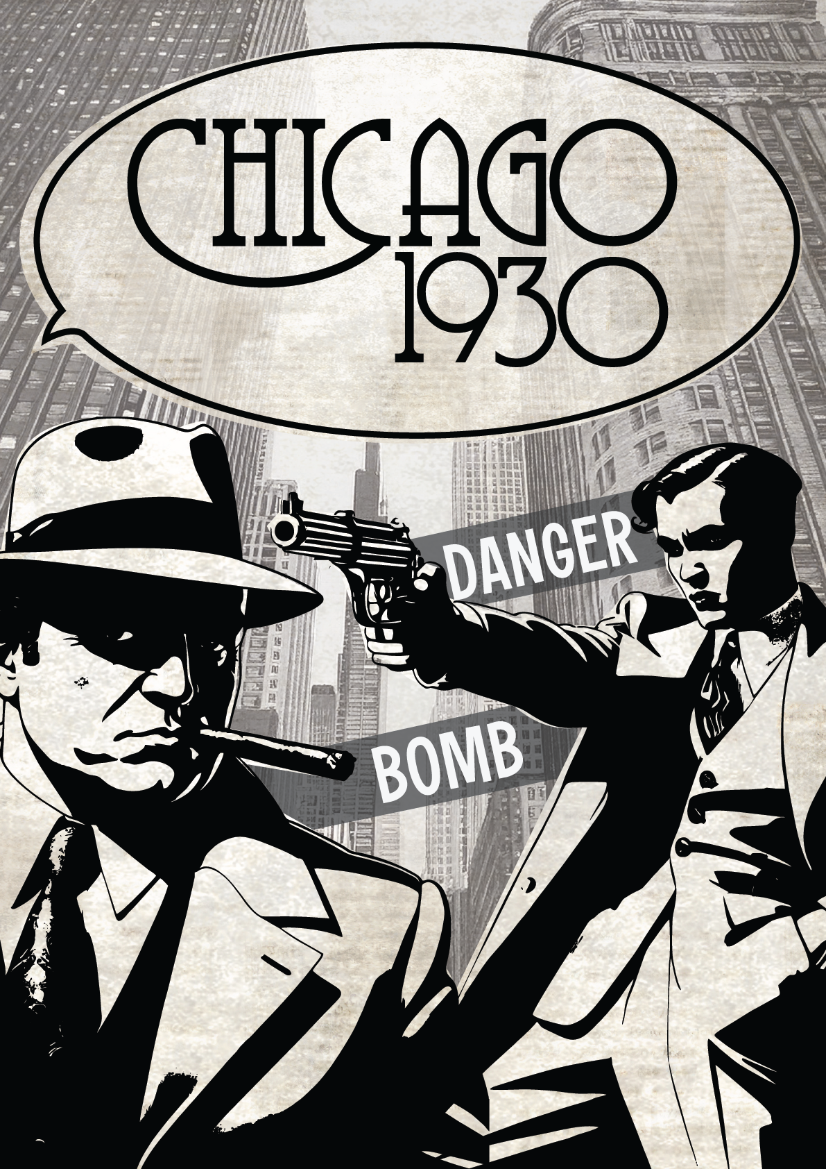
Each poster was created to fit the theme of each room: 70's Hold Up, Chicago 30's, Hikikomori, Uranium 235
WEB DESIGN
BEFORE
AFTER
